

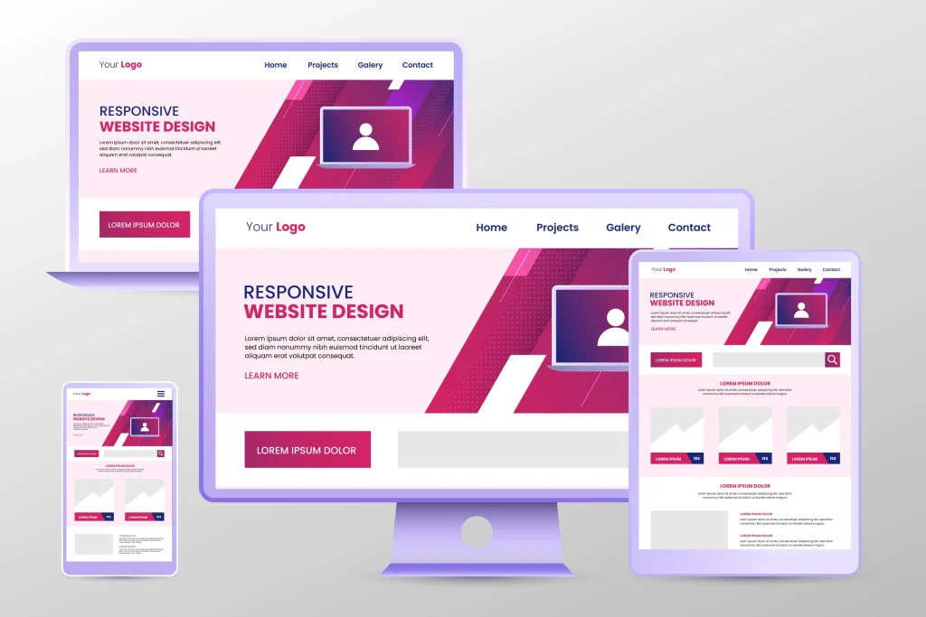
In today’s digital landscape, having a responsive website is no longer optional—it’s essential. With users accessing websites from various devices, ensuring a seamless experience across all screen sizes is crucial for user engagement, conversions, and SEO rankings. Responsive design enhances usability, accessibility, and performance, making it a fundamental aspect of modern web development. Here are the best practices for responsive website design in 2025.

1. Mobile-First Approach
A mobile-first design strategy means prioritizing the mobile user experience before scaling up to larger screens. Since mobile traffic has surpassed desktop usage, designing for smaller screens first ensures usability, faster load times, and better performance. Techniques include minimizing content clutter, using collapsible menus, and optimizing touch gestures. Google’s mobile-first indexing also rewards mobile-friendly websites with better search rankings.
2. Flexible Grid Layouts with CSS Grid and Flexbox
Modern responsive design relies on flexible grid systems to create fluid layouts that adapt to different screen sizes. CSS Grid and Flexbox provide powerful ways to align and distribute content dynamically without relying on fixed-width elements. Grid-based layouts allow designers to define reusable structures that automatically resize based on viewport dimensions, ensuring a consistent look and feel across devices.
3. Optimized Images and Media for Faster Loading
High-resolution images and videos can slow down website performance, affecting user experience and SEO rankings. Best practices for image optimization include:
- Using modern image formats like WebP and AVIF to reduce file sizes without compromising quality.
- Implementing the
srcsetattribute to serve different image sizes based on the device resolution. - Leveraging lazy loading to defer off-screen images and videos until needed, reducing initial page load time.
4. Adaptive Typography for Readability
Text readability varies across screen sizes, and using relative units like em, rem, or vw ensures that typography scales dynamically. Best practices include:
- Setting a fluid typography scale using
clamp()to adjust text size based on screen width. - Implementing line-height and letter-spacing adjustments to improve readability on small and large screens.
- Utilizing contrast ratios and color schemes to enhance visibility in different lighting conditions.

5. Speed Optimization Techniques
Website loading speed directly impacts user engagement and SEO. Key optimizations include:
- Minifying CSS, JavaScript, and HTML to remove unnecessary code.
- Using a Content Delivery Network (CDN) to serve assets from distributed servers.
- Enabling Gzip or Brotli compression to reduce file sizes.
- Caching static assets to improve repeat visit load times.
6. Touch-Friendly Navigation and UI Elements
Since many users interact with websites via touchscreens, designing touch-friendly elements is essential. Best practices include:
- Ensuring buttons and links have a minimum tap target size of 48×48 pixels.
- Using swipe gestures and sticky navigation menus for improved usability.
- Avoiding hover-based interactions that don’t work well on touch devices.
7. Cross-Device and Cross-Browser Testing
https://www.browserstack.com/Regular testing across multiple devices, screen sizes, and browsers ensures a consistent user experience. Tools like Google Chrome DevTools, BrowserStack, and LambdaTest allow developers to simulate different environments and fix inconsistencies. Key considerations include:
- Checking for breakpoints and layout shifts.
- Ensuring interactive elements work on touchscreens and desktops.
- Testing form usability and input responsiveness across devices.
8. Dark Mode and Customizable Themes
With the increasing popularity of dark mode, designing websites with adaptable color schemes enhances accessibility and user preference. Using prefers-color-scheme in CSS allows the website to automatically switch between light and dark themes based on the user’s system settings.
9. Enhanced Accessibility (WCAG Compliance)
An accessible website is essential for inclusivity and legal compliance. Best practices include:
- Using semantic HTML to improve screen reader compatibility.
- Ensuring keyboard navigation works across all interactive elements.
- Implementing ARIA (Accessible Rich Internet Applications) attributes to enhance UI accessibility.
- Testing with accessibility tools like WAVE and Axe to identify potential barriers.
10. Progressive Enhancement for Future-Proofing
With emerging technologies and browser updates, websites must be built for long-term adaptability. Progressive enhancement ensures that:
- Basic functionality works on all devices, while advanced features enhance experience on modern browsers.
- Websites remain compatible with upcoming web standards and evolving best practices.
Future-Proof Your Website Today!
Ensuring your website follows these best practices will keep it competitive in 2025 and beyond. A responsive website enhances user experience, improves SEO rankings, and drives conversions.
Need help optimizing your website for responsiveness? Cloudix Digital specializes in cutting-edge web design and development solutions. Contact us today to future-proof your website!


